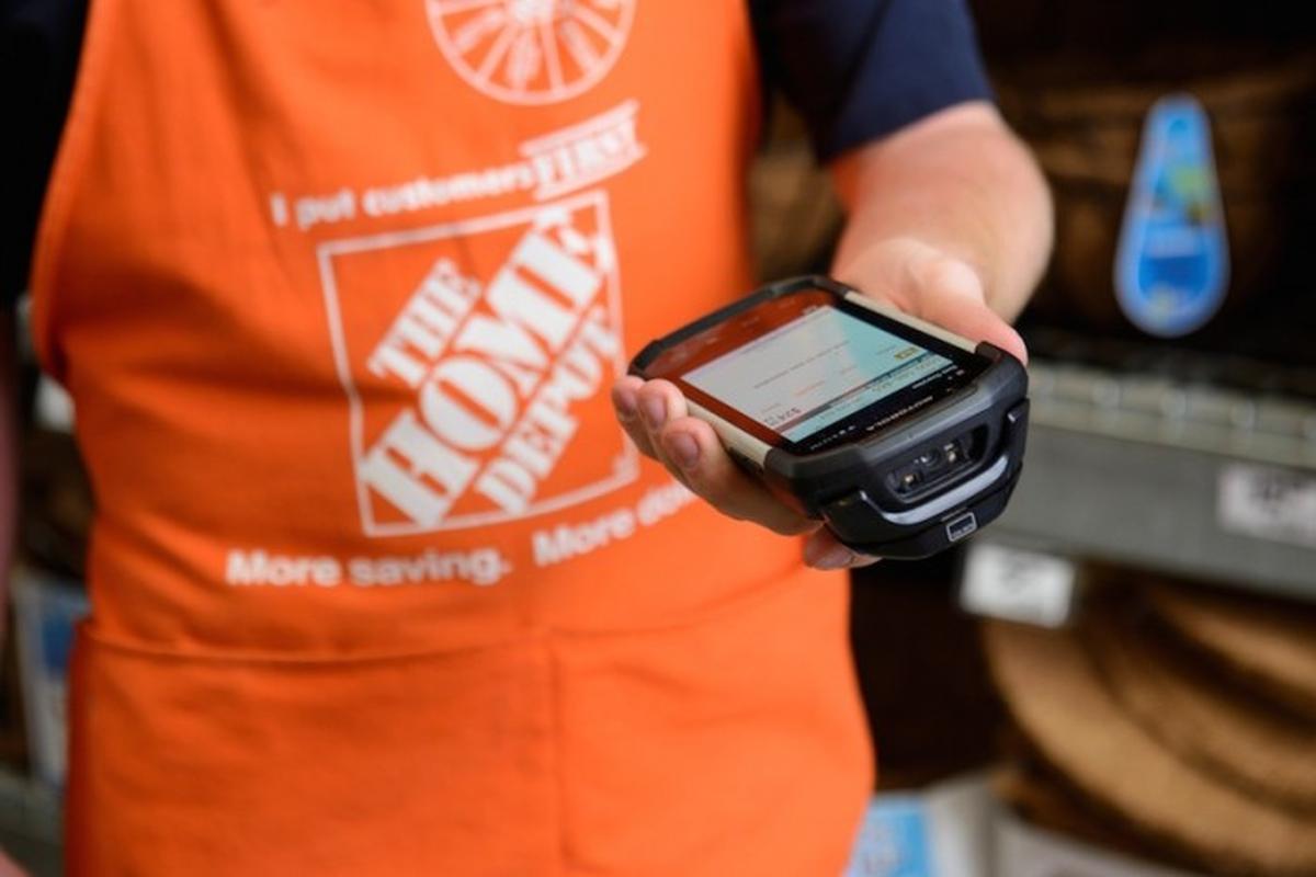
What is the First Phone?
The First Phone is a bulky android phone with a built-in RFID scanner and a custom user interface loaded with 40+ applications to help associates complete in-store tasks. The problem however, is that the process of using the First Phone is terribly complicated.
The Problem
The phone is crowded with multiple applications, most of which are only used to complete a single operation within a task. As a result, completing a task requires having to launch two to three applications at a time while passing data between multiple apps. Additionally, many apps have overlapping functionalities creating inconsistent and redundant paths to completing a single process. This leads to a confusing and disorienting experience that slows down associate’s work flows, hinders the acclimation of new hire associates, and results in massive time wasted and money lost for the company.
A design challenge emerged...How can we devise a solution that removes the friction of using the current First Phone, and reduces the cognitive load for completing tasks?
Research & Findings
To begin, my team and I conducted a series of research methods ranging from interviews with our target users and corporate stakeholders, ethnographic studies with store associates, and an online survey with workers from various roles and departments to better understand the role of the First Phone and how it’s percieved.
Through this research we gained information regarding the structure of the FirstPhone and its ties with the rest of the company from a developmental and organizational perspective, valuable insight into the day-to-day operations of associates interacting with the FirstPhone and how these interactions are context and role dependent, as well as both qualitative and quantitative data to help us better empathize with the user and understand their pain points and frustrations.
Identifying Key Information
At this point we had learned about our users. Now it was time to distill the information and use the data to inform our design.
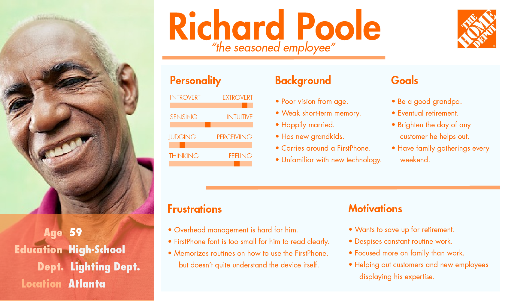
Personafying the Users
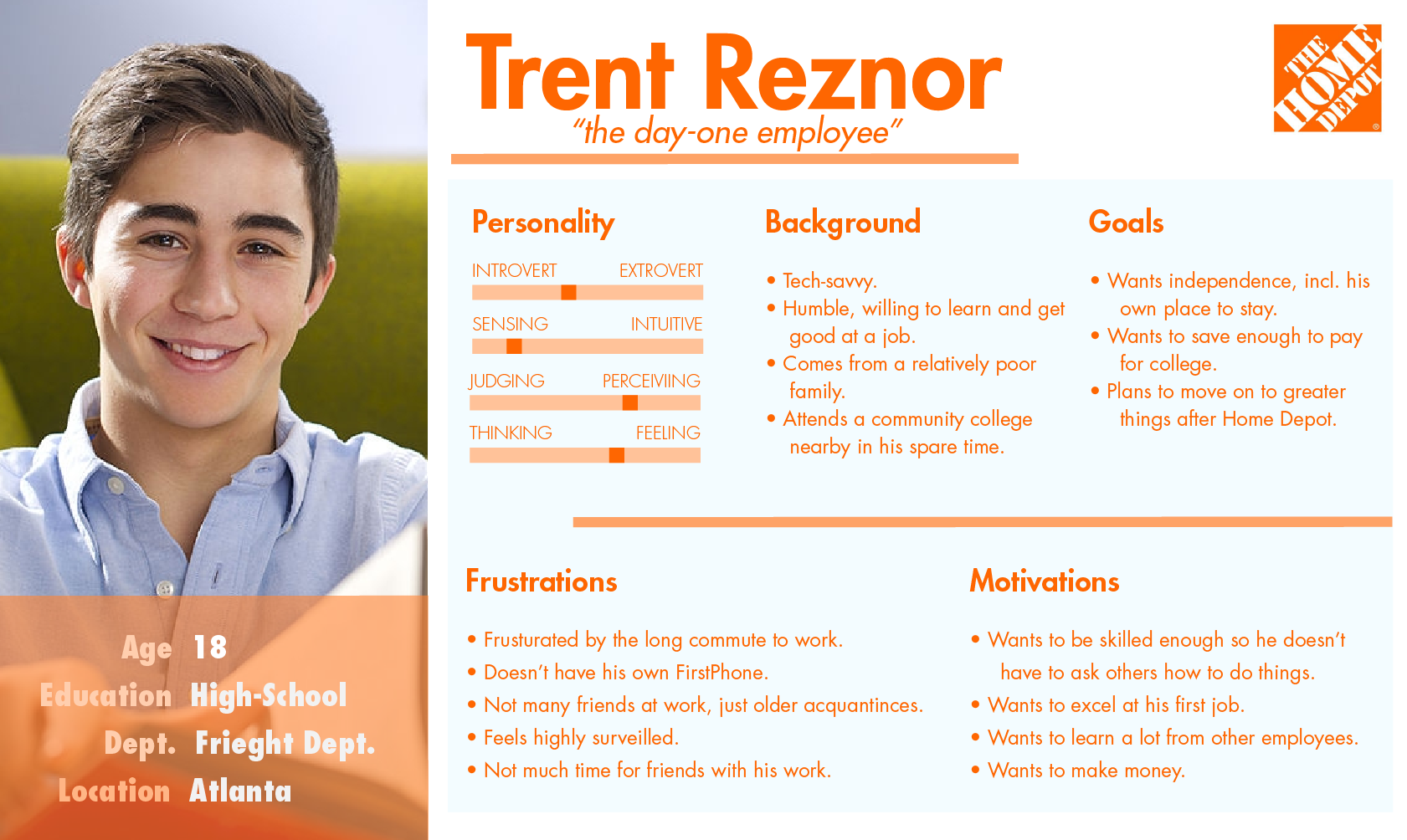
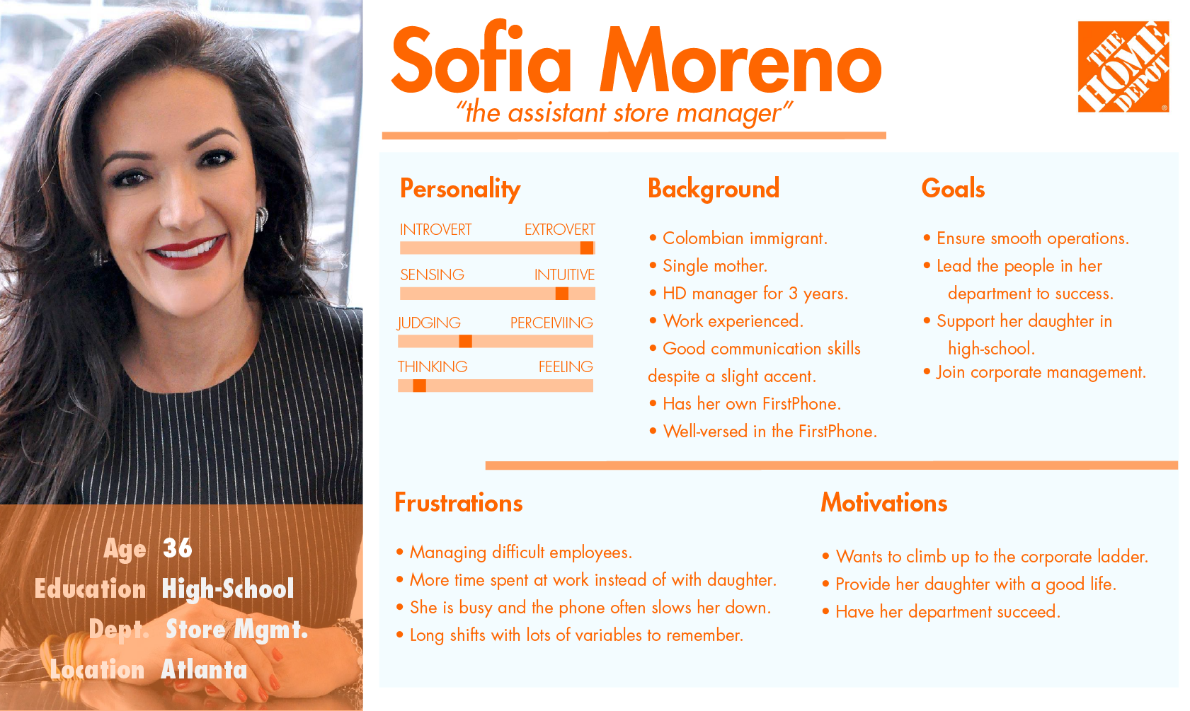
Analyzing our data revealed three common motifs among our user population, and we created associating personas for each. This allowed us to define our user’s needs and goals, effectively defining the characteristics of our design.
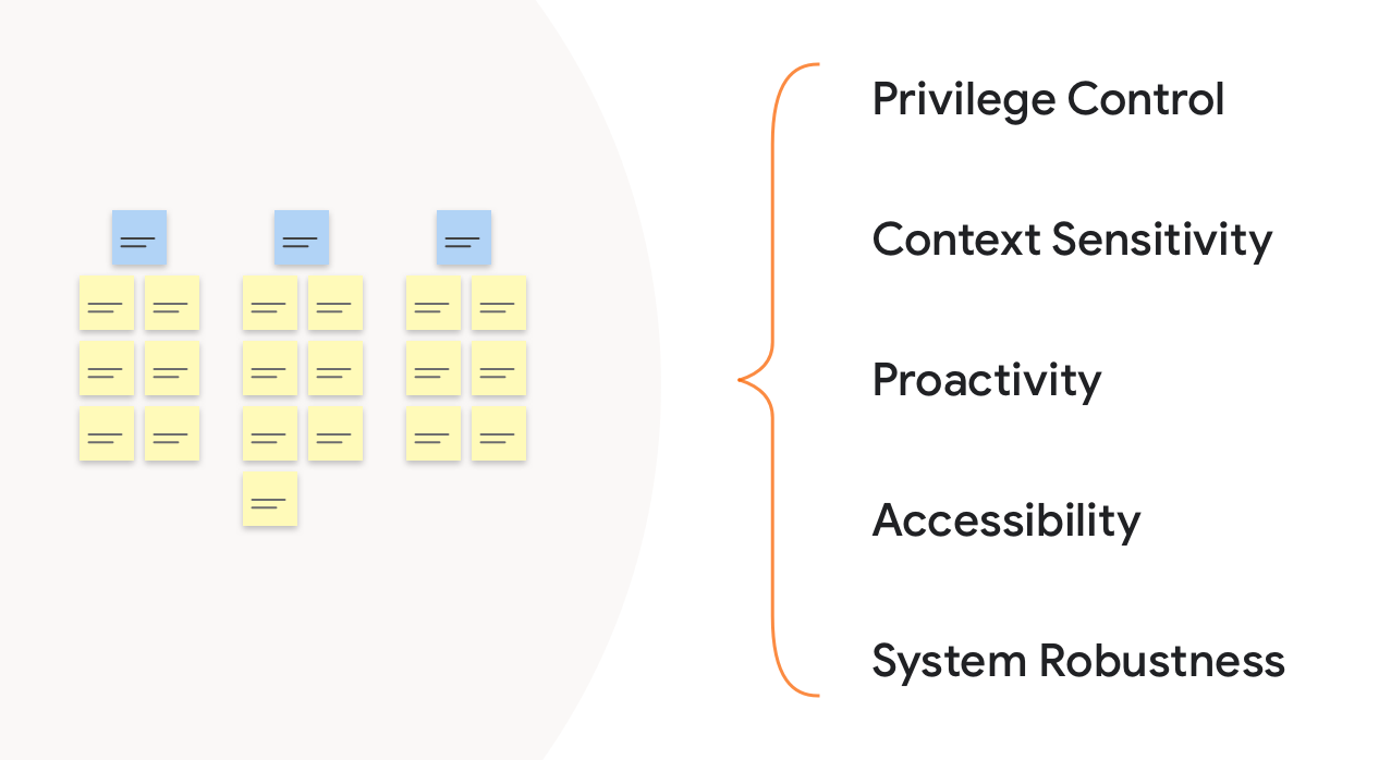
Affinity Diagraming
We then conducted an affinity diagramming session to analyze our research data. Organizing individual data points into similar themes brought out important implications for our design. At a high level these implications include privilege control, context sensitivity, proactivity, accessibility, and overall system robustness.
Concepting
Using the information gathered we created three low-fidelity mockups in order to conceptualize our design ideas. Each of the concepts captured all of our design implications, but represented a different model of how a user would accomplish a task.
Task Based Design
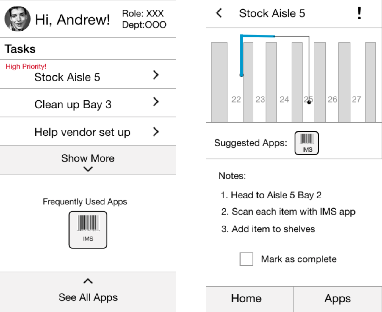
The first concept was a task based design that served as a helpful launcher on top of the existing grid of apps. The aim was to streamline the process and reduce the learning curve for day-one employees.
Process Based Design
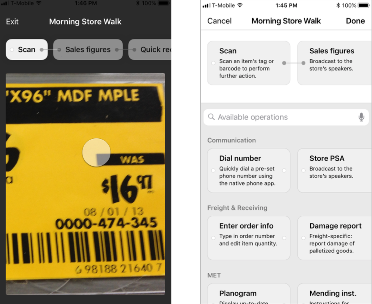
The second concept was a process based design focused on streamlining user’s workflows by presenting all of the relevant functions in one place so that they could be chained together in order to complete tasks.
AR Based Design
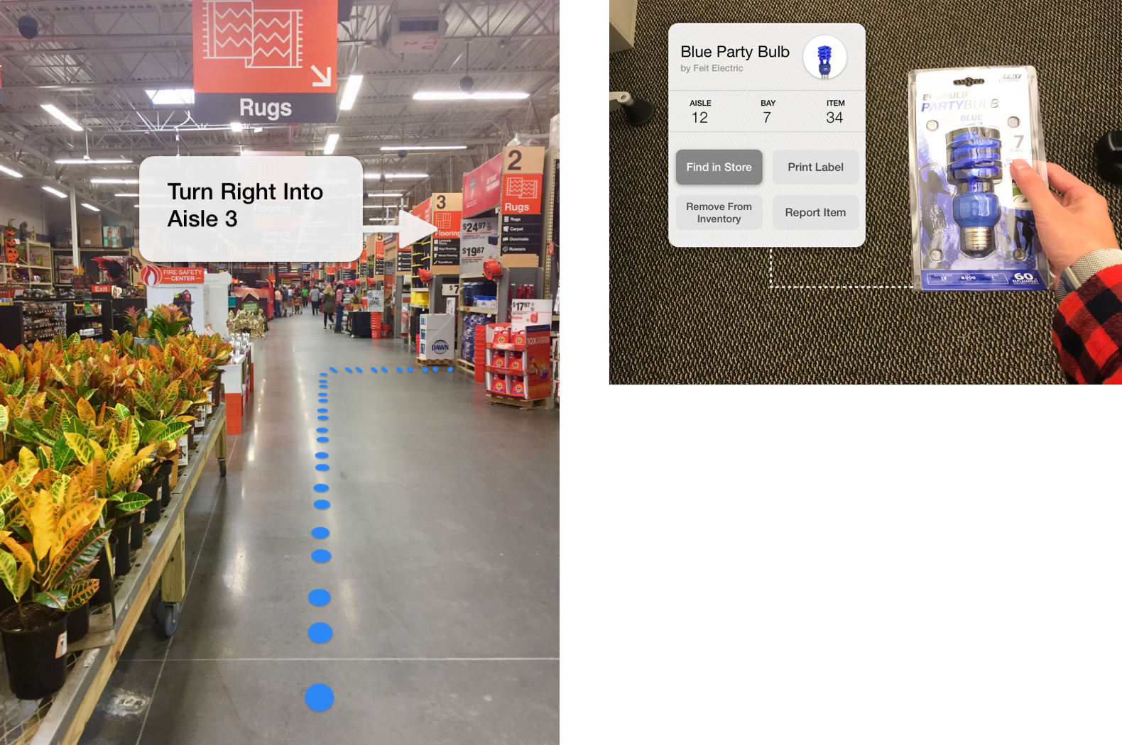
The third concept moved away from the notion of apps and focused on context awareness. With the help of augmented reality (AR) on a smartphone, user’s could point their camera at an item and see all relevant data and actions.
Testing
We conducted a focus group at a local Home Depot store with six associates of various roles and gathered feedback on different aspects of each concept. We found that the AR concept was the most well received, along with the task based nature of the first concept. In developing our final design we tried to combine those elements that proved successful from our concepts while still trying to make our design a cohesive experience that wasn’t too complex to use.
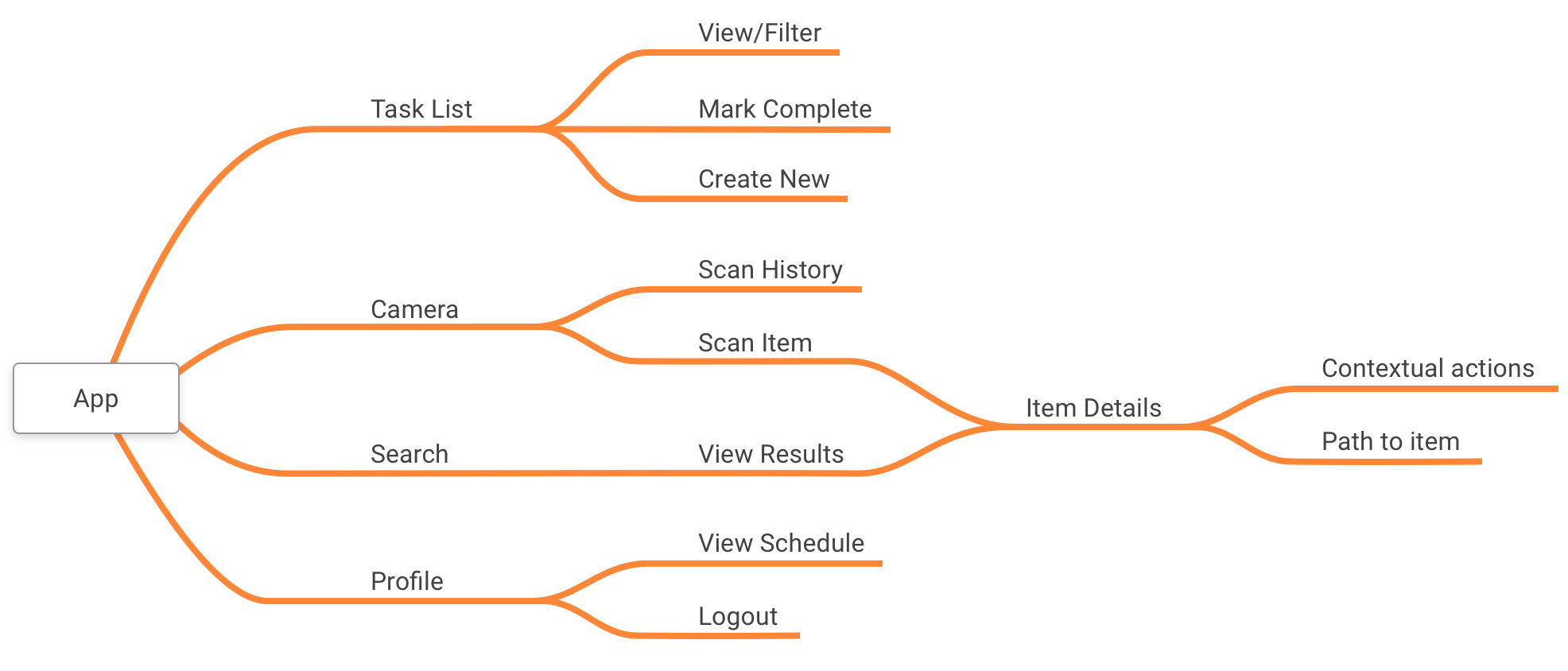
Architecting the Information
Developing a clear information architecture was crucial for our design. We wanted to ensure that we were incorporating everything we had learned thus far in the cleanest way possible, and having a birds-eye view of our system really helped in ironing out the small details.
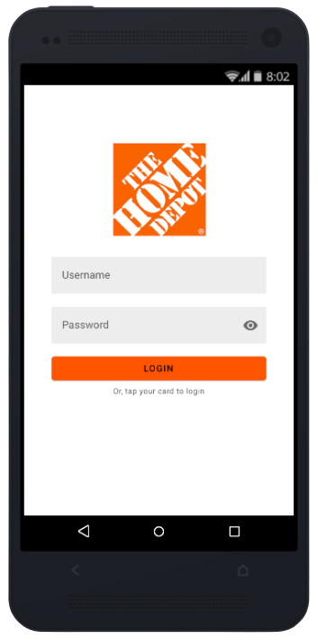
Using Sketch and InVision we were then able to quickly translate the information architecture into an high-fidelity prototype. This design was then presented to Home Depot associates in a usability testing session as an interactive prototype running on a mobile phone, allowing them to get a better feel of what the finished product would look like. Using the results from our usability testing session we were further able to iterate on our system design
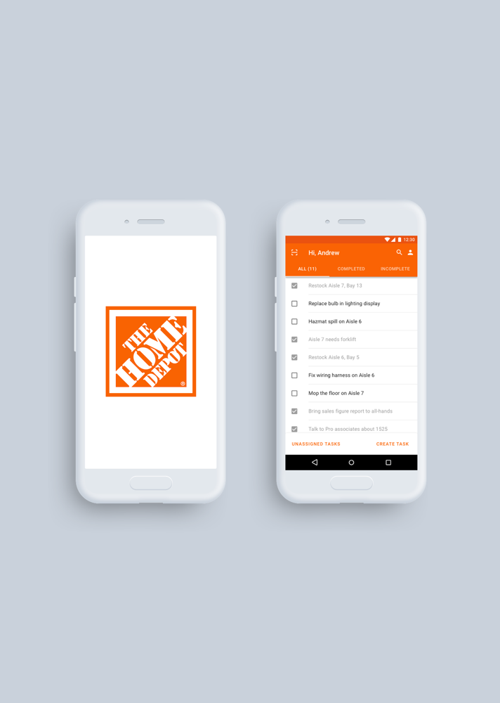
The Design
Below is interactive demo of our final prototype. We presented this final prototype to Home Depot UX designers for a heuristic evaluation and to share everything we had learned throughout the process.
Final Note
Overall, the Home Depot UX team was quite pleased with the restructured flow and system design from a usability standpoint, claiming that this truly took on the “scan-to-start” notion that they had originally envisioned. They also liked the updated aesthetic and design consistency that played on people’s familiarity of using their own smartphones.
With this redesigned system, however, there are still aspects that need to be further considered. Things like accessibility support, visibility of system status, error handling, etc. would greatly enhance our design and ultimately provide a better experience for the end user.